Friday, 12 September 2014

NME Front Cover Deconstruction


This is the second of my three deconstructions.  It is a copy of NME featuring Nirvana on the front cover.


Masthead- Like 'Q', the masthead for 'NME' is positioned in the top left hand corner.  Again, it is partly covered which means it is an established magazine and is widely known and popular.

Text- The headline is not very big, however the name of the band in the middle is.  The use of 'Nirvana' as the largest piece of text on the page will grab the attention of fans of the group.  There is a buzzword at the top- 'Win'.  This stands out more than the details below it because only one word is needed to spark interest.  The competition details also contain buzzwords like 'limited edition' and 'exclusive'.  I do not intend to put competition details on my front cover, however I do intend on using the buzzword- Exclusive.  There are a lot of cover lines which informs you it has a lot of content...something for everyone perhaps.  The cover lines along the bottom of the cover are introduced by a '+' sign.  Not using the actual word is more interesting as it means there are less words cluttering up the page.  It makes the cover become more diverse.

Colour- Nirvana's trademark colour is yellow.  This is reinforced by the colour palette.  The yellow trademark is put over a black background which is also reinforced by the darkened clothing.  The use of white puts the spotlight on the men, however their faces stand out because they have been altered to look more grey and shadowed.  This use of dark colour is not something which I am planning on using, though I will use dark colours on my front cover at some point.

Font Styles- The fonts used for the headline and strapline are bold and straight, however another font is used which is styled like spray paint.  If a font is attractive enough, it could be said to be the unique selling point of the magazine.  On this cover, the use of font appeals highly to fans of the magazine.  The font used for the headline is one that I would like to use in my magazine as it is bold, yet subtle.

Layout- The main (and only) image is not fully visible- the members on the left and right do not fit the page.  This is effective in numerous ways.  One, it means the image is large so there is more focus on them and two, it allows the headline and strapline to go right across the page in a straight line.  The cover lines at the top are situated where there is a gap, giving enough room.  The cover lines at the bottom are on the right hand side because the barcode is on the left.  There are other components inside the barcode which is very common in magazines.  This is usually the date, price or issue number.  I will follow this when creating my magazine and I will place the barcode at the bottom of the page too.

Images- The picture of Nirvana is the only one on this front cover.  This is a better idea as it allows the rest of the cover to be inspired by Nirvana by using their trademark colours.  This is an idea I had in mind for my work when I started doing research.  Evidently this issue has a lot on the group.  It is also clear it is a detailed music magazine, tempting fans to buy it.

Mise en scene- The members are wearing typical clothing.  I plan on wearing something similar.  The lighting is shadowed so it appears grey.  This is needed as there is a white backdrop and the clothing is dark.  Clearly, the lighting has been set up so that the clothing look darker anyway.  This front cover is inspirational for me because using a white backdrop is something I plan on doing, though I do not want to have a somewhat 'menacing' look like the member on the left and in the middle.  I know that I will not have certain details on my person like the ring in this image.

Semiotics- Clearly this is for fans of rock music and Nirvana.  It is apparent however, that it is aimed more at fans of Nirvana as the 3 shade colour scheme uses the colours from their logo.  Many fans of rock music may look at this and not want to purchase it as they assume it is meant for fans of Nirvana.


Wednesday, 10 September 2014

Q Front Cover Deconstruction


I will be deconstructing three magazine front covers in order to gain a thorough understanding of conventions and effective magazine design.  It will help me gain some inspiration for my project.  I will be analysing the masthead, text, colour, font styles, layout and images.  This is my first deconstruction.  It is 'Q' magazine with Jimmi Hendrix on the cover.


Masthead- The logo for 'Q' magazine is bold and stands out.  This is achieved by the colour scheme of red and white.  Its position works well as it allows more room for a larger main image.  Personally, I will have a one worded masthead.  The idea of a square is simplistic, but effective.  Directly underneath the masthead, there is a black box with white text which reads, 'The modern guide to music'.  The word 'modern' tells the reader it will appeal to a young audience and that it is written and designed in a way that also catches the eye of a young audience.  The font used for the masthead is modern, but my font is going to be more unique, but have the appearance of something older.

Text- The main image is eye catching, but is supported by the headline which says 'Wild Thing'.  The word 'wild' emphasises the behaviour of Jimmi Hendrix as an artist and the use of the word 'thing' gives him his own unique identity as a possibly mad, but passionate singer.  The strapline also contains an important word- 'undiscovered', meaning the feature on Hendrix will be something new and certainly appealing to fans.  The cover lines are bold, containing words like 'Sex Gods' and the phrase 'Ta-daaa'.  These cover lines are short but this is clearly better, grabbing the attention of someone looking at it in a shop.  This effective technique is certainly something I would like to use.  On the right there is a circle with the words, 'The World's greatest album guide'. 'Greatest' improves the image of the magazine.  This word is the largest in the circle, meaning it is the word you will look at first.

Colour- The colour scheme is red, white and black.  The image boasts a rich blue and gold, which are evidently the primary colours for getting peoples' attention.  The lighter colours such as red and light orange are present at the top of the cover and the darker colours such as black and blue are present from the middle to the bottom of the page.  The costume Jimmi Hendrix is wearing dominates the cover as the gold is shining and is arranged in a pattern.  The instrument on the ground is also appealing due to its glimmering gold and bold red.  On my front cover, I plan to use colours that will stand out and look dominant such as green and dark blue.  Overall, I will use a 3 shade colour scheme.

Font Styles- The font for the features is simple, but due its boldness, it stands out effectively.  'Not!' is in italic and is underlined which breaks up the ordinary looking text.  The text- 'The World's Greatest album guide' is in 3D.  The use of this speaks to the reader.  It is interesting and causes the words to look like they are somewhat coming off the page.  Apart from the cover lines, my front cover would be supported by something extra like this.

Layout- The date and price lie directly below the masthead.  The top right hand corner has a rectangular box with more features and underneath it tells you there is loads more.  This informs you the magazine is detailed and worth the money.  The box has five stars at the top.  These decorate the box, but are also significant of the rating system- five stars being the highest you can go when reviewing something.  This boosts the reputation of Q because it is secretly telling you it is a high quality magazine.  The barcode is also on the right hand side.  I will follow this commonly used idea of placing the price inside the barcode, but leaving the issue number and price out of it.

Images- The image of Hendrix is the main one and is large enough to cover part of the logo which resides in the top left hand corner.  This is common for magazines- especially if they have been out for a long time, meaning people do not need to see the entire logo as they already know what it is.  I will only slightly cover my masthead.  Hendrix looks energetic and in very high spirits.  His clothing suggests a love of music and that he is not afraid to be himself.  His rings are also unique, suggesting he is experienced.  The size of the image catches peoples' attention as it goes from the top to the bottom of the cover.  This is an idea I would like to use in my personal project- an image that fills the front cover.   

Mise en scene- The unique clothing looks even more so due to the lighting, which makes the gold shine brighter.  The lighting has been used well as it focuses on his hair and hands.  Because of the lighting, the blue and purple colors gain more presence.  There is no location- it is uncommon for the image on the front cover to have been taken outdoors.  Instead it was taken with a white backdrop.  I will either do that, or I will edit my background and put it onto a white background.  Hendrix is looking down at the instrument below him, but appears very excited.  His body language connotes he is passionate.  From looking at his hands, the audience can evaluate that he is driven by music.

Enigma codes- 'Wild Thing' intrigues the reader because of its short but inventive adjective and its suggestion that Hendrix is in a class of his own.  As enigma codes ultimately encourage the reader to view the article, I plan on using them in my work.  I like the use of it on this front cover.

Semiotics- I can see from this cover that people of an older audience would be drawn to it.  This idea is based on the featured singers who are not recent and the use of old fashioned clothing.  These things work together to persuade the target audience to buy the magazine, but do not attract the attention of younger audiences.  My magazine will be for teenagers and young adults and the cover will let the reader know this.


Monday, 8 September 2014

Enrolment Tasks

       
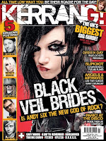
My first enrolment task was to choose 3 magazine front covers and say who the target audience was and how I knew that, based on colour, font type, language, celebrities etc.  I chose 'Kerrang', 'Q' and 'Uncut'.


Next, I was asked to do an essay on my idea for a magazine design. 

Natmags Magazine- ‘Blast’

My magazine for Natmags is aimed at 16-19 year olds.  The front cover would have a colour palette of yellow, white and blue.  The masthead’s position would be at the top of the page but tilted to the side to reinforce the fact the magazine is informal.  It would also speak to its young audience.  The main feature would be on the Arctic Monkeys.  The four members would be on the front cover.  The headline would be white as it is a colour associated with the group.  The headline would read, ‘Do you wanna know?’ which refers to their song- ‘Do I wanna know?  This reference would only be understood by fans of the Arctic Monkeys or most probably by music fans.  They would have to be wearing blue and white as it would go well with the yellow masthead.  The clothing would also have to be something fans of the Arctic Monkeys are used to seeing them wear so they are more attracted to the cover. 

As it is a music magazine, I think it would be a better idea to include a banner above the plugs instead of just text.  I have an idea of having a sign that says- Access all areas.  This again speaks to the audience well.  It does not grab the attention of people well out of the age group of 16-19.  The colours are not bright enough to justify it as a children’s magazine- plus, the Arctic Monkeys are most popular with the younger generation.  They are listened to mostly by teenagers.  The headline would have unique font which would apply to the audience.  It would be wide and very animatic.  The contents page would need to inform the reader on the featured articles.  It is also relevant to include the Facebook or Twitter icon to let the reader know that the information about the magazine can be accessed on social networking sites.  The articles and features I would include are:

- A double page spread on the Arctic Monkeys as they are on the front cover and are therefore the main feature of the magazine. 


- I would need to include singers or bands who are similar to the Arctic Monkeys or who share the same type of fans.  Examples that I could include are Paramore or Disclosure.


- Most magazines have prizes on offer that the reader has to win.  I have chosen to have Ed Sheeran’s new album ‘X’ available to win. 


Below the images of featured articles or competitions, I will have topic dividers which are above columns which also include featured articles and interviews.  The first column will be titled ‘Exclusive’, focusing on new, exclusive interviews and images that have been taken especially for that edition of the magazine.  I have chosen to include Ed Sheeran and Coldplay.  The second column will be called ‘Interviews’.  It will also feature articles exclusive to the magazine as the people being interviewed are doing it purposefully for that magazine.  This column will focus on The Script, George Ezra and One Republic. 

The people involved in the ‘Exclusive’ section and the ‘Interview’ section are all current.  This means that if people have only bought the issue because the Arctic Monkeys are on the front cover, they may still want to take a look at the other singers and bands in the issue.  The third and final column I have decided to title ‘Charts’.  These pages in the magazine will have the UK Top 20 or 40.  They will also look at No.1 songs and the biggest hits of the months.  This works well as it is a monthly magazine.

The reason I have chosen this format is because it appeals to the age group.  The Arctic Monkeys, Paramore and Disclosure are not too different and will share many of the same fans.

The main article I have chosen is on the Arctic Monkeys.  It is about their future as a band and also about how they want to change their name.  This provides some humour.  The Arctic Monkeys have a massive teenage fan base.  On the left page there are four separate images of the four members of the band.  On the right page, this is repeated but the images are darker.  This contrast emphasises the tone of the band- telling you they have different sides to them.  The target audience of 16-19 may not want to read massive amounts of text, so the interviews will be quite small.  I have decided to do a separate interview for each member.
 
The headline and titles will be in a unique, stand-out font.  This draws the reader in and makes reading the feature more worthwhile.  If it looked boring, then even fans of the Arctic Monkeys may be put off by it.  However, looking unique will make fans of the band and music fans feel their time has been well spent.  The target audience will obviously like to listen to music in their spare time and reading this feature has to be entertaining to them.  It needs to be taken into account that some of the people reading it may not like reading, so it does need to speak to its target audience.  Also, the Arctic Monkeys have been very popular and successful lately, so a double page spread on their future is something that fans will naturally want to read.


Lecturer comments: 'A.  Well done Ben- you seem to have some excellent ideas here.  You demonstrate a solid understanding of how magazines work and a solid understanding of some of the conventions- overall this is a solid piece of work.  Well done!  You have a good knowledge of genre also.'


Introduction Post

My name is Ben Carter and this is my introduction post for AS level Media.  I will be designing a front cover, contents page and double page spread of a music magazine.  Before I begin the creative project, I will be carrying out research and planning.  After I have completed the creative project, I will evaluate what I have done.  This evaluation will need to be as detailed as possible and cover everything that I have done in the previous two stages of my coursework.

The type of magazine that I plan to produce is on the music genre, 'Pop'.  I originally planned to produce a magazine on Indie music.  The Arctic Monkeys was the band  that I looked at first.  Since then, I thought I would produce a better magazine if I focused on a genre I was more familiar with.  In keeping with the idea of bands, I thought about 'Pop Rock' and bands such as One Republic.  I have, however decided to focus on singer/songwriter Ed Sheeran and look at the props and clothing he wears in magazines and photoshoots.

The magazine 'Q' contributed to the idea for my magazine.  From researching different covers of Q magazine, there were a lot that featured only one image.  The singers' face filled a large portion of the cover, too.  I will use this idea in the process of creating my magazine.  The Q logo is a white letter q in a red square.  Ed Sheeran has released two albums, one of which was dominated by orange and the other which was dominated by green.  I will consider this when choosing the colours for my front cover.  Many magazines change the colour of their logo or masthead based on what is on the front cover.  For example, if a magazine featured Nirvana on the cover, the designers may creatively change the masthead to yellow- a colour associated with Nirvana. 

Upon looking at work completed previously, I can see that the finished project will have to look very much like a professional magazine- one similar to an issue you can buy.  I am aiming in my creative project to produce something that appeals to people who read a physical version of a magazine and people who read a digital version.  I looked at work done by another student, who not only included images of themselves in the issue, but created an original illustration of Alex Turner from the Arctic Monkeys.

 
Below is a mood board which I created to illustrate what listeners of pop and pop rock music might enjoy.  It also contains logos of brands such as 'Monster' and 'MTV' as they are popular amongst the younger generation, who are going to be the target audience of my magazine.  Mood boards are a collection of images that appeal to a particular target audience.  It will help me when I come to design my magazine as I can use these artists and bands on my sell lines and contents page.