These are the pictures I have taken for my magazine. Not all of them will be featured in the final product and I will say why I will not be using them. The ones I have chosen are also featured here and I will explain why I have chosen that image.Front cover image

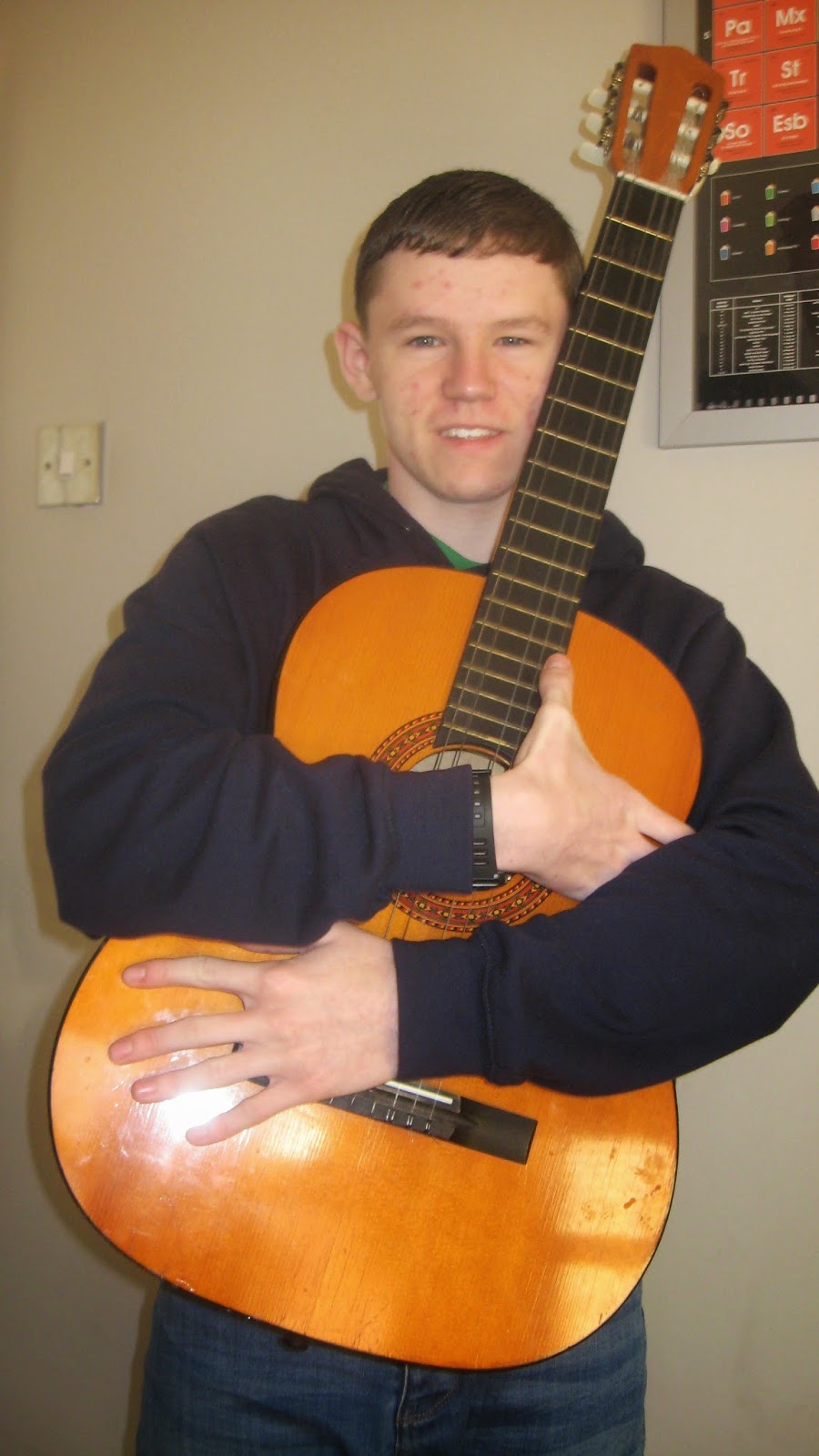

The image on the left does not look right for a front cover as there is not enough space between myself and the guitar. The middle image will be tried out on my first draft, however if it is not suitable, I will use the image on the right instead. The last photo would definitely work as it would fit well in the middle of the page.
Contents page images


 The first image of myself will not be used as it includes less colour than the picture on the right. This image will be used instead as it includes green and blue, not just green. The images of the guitar and piano are perfect for my magazine as they have the right amount of lighting to make the props stand out. The guitar will need to be cut around however as that is all that needs to be focused on.
Double page spread images


The first image at the top is not suitable for my magazine as it does not show enough space, whereas the image on the right does, therefore that is the one I will use. On the bottom row, the image on the right is the one I will choose because, once again, it shows more space and having me facing my right looks better considering it will be on the right sided page of the double page spread.
No comments:
Post a Comment