The cover image will be a medium shot as it is conventional of magazines to do this. It puts emphasis on the actor without distracting the reader from the rest of the items on the cover.
The image of me on the contents page will be a medium shot as the colour of the clothing will add to the appeal of the magazine. The piano image will be a close up to make the page more varied and interesting.
The main image on the double page spread will be a wide shot because it is essential in selling the article, especially as it is going to be taken outside. The smaller image on the double page spread is going to be a medium close up in order to stick to the 'up close and personal' concept that is carried throughout the interview.
Friday, 31 October 2014
Flat plans and rationale for main task
Flat PlansBelow is a flat plan for my front cover, contents page and double page spread. This will help me when designing my product as it will act as a guide.

Rationale
This rationale describes my decisions and explains why I have made them.
Colour Usage- The cover will use the conventional three shade colour scheme. It will be green, blue and black. These colours work well together. The masthead will be a darker shade of blue to match my clothing. My contents page will have the colour scheme of red, blue and black to give it its own identity. The colour scheme on my double page spread will be blue, green and orange, but will have white lighting on an image so that it looks more like a real magazine.
Image Usage- The single image on the cover will be taken indoors but the background will need to be cut as the front cover has a white background. I will be holding a guitar in this image, plus it be a close up shot. The guitar will also feature on the contents page so I will have to edit the background of that image too. Another image on the contents page will be of a piano. Props such as these anchor the genre of magazine, as does other connotations of music, which I will display in my article through use of a microphone.
Text Usage- The title 'Vocal' belongs to music terminology. As is conventional, the sell lines and content listings will engage the audience and speak directly to them. The main sell line on the cover will stand out more and will hook in the reader through use of buzzwords. My article will be in the first person- with the interviewer asking the questions.
Layout and Font- On the cover, the sell lines will be placed on the left and right with the image in the centre. This puts focus on everything on the cover. I will use a typewriter font called 'Veteran Typewriter' for the masthead and a more basic font for the sell lines and the contents listings. I am placing the images on the contents page further to the top so that it is easier to navigate. The dps will use a basic font for the article, but a bolder font for the headline. I will use the conventional three columns which will look effective over the bottom image.
Thursday, 30 October 2014

Saturday, 27 September 2014
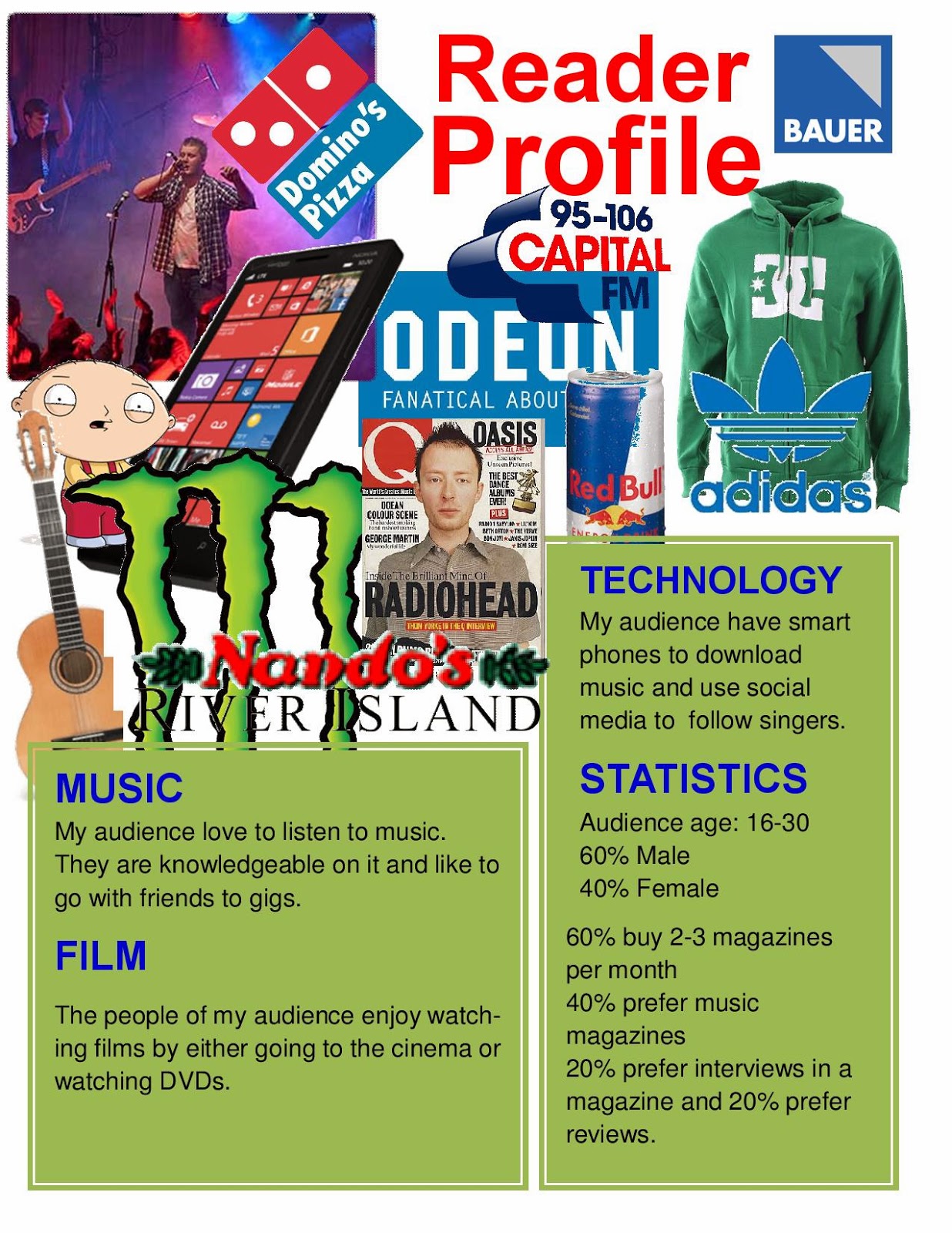
Reader profile
This reader profile utilizes the findings from my surveys. The images and text show my audiences likes and interests.
Friday, 26 September 2014
Survey Analysis 2
For my qualitative research, I conducted a number of interviews in order to gain a better understanding of people's ideas and preferences. I asked them the questions from my paper-based surveys, but I wanted them to provide more detail about their choices in order to gain a better understanding of their preferences.
The first person I interviewed was an 11 year old female. She said that fashion magazines are her favourite because they have better images. It is clear that things like clothing and make-up improve the images in fashion magazines. She said that Pop is her favourite genre as it is good to dance to, so it is obvious that pop music is most popular amongst young people. I found out that she listens to music after school and at the weekend- meaning she listens to it a lot.
The first person I interviewed was an 11 year old female. She said that fashion magazines are her favourite because they have better images. It is clear that things like clothing and make-up improve the images in fashion magazines. She said that Pop is her favourite genre as it is good to dance to, so it is obvious that pop music is most popular amongst young people. I found out that she listens to music after school and at the weekend- meaning she listens to it a lot.
The fact she said images drew her into a cover the most tells me that she likes the image to be appealing to her- preferably someone she is familiar with or is a fan of. Another one of her answers was that she buys 2-3 magazines a month, but will only pay between £2.00 and £3.99. This helps me because I think it would be safer to put the price of my magazine as £2.99. Finally, my interviewee said that her favourite part of a magazine was real life stories. My article is going to follow what the response was- finding out about people's lives.
My second interview was with a 40 year old female. They preferred 'women's magazines including celebrities, health and beauty and real life stories- which she said was her favourite thing in a magazine. Evidently, women prefer fashion magazines because of their appealing images and colour. This means that my product will be targeted more at males. Like in the first interview, pop was this persons favourite genre. She said it had always been her favourite, meaning my product stands more of a chance of being successful. She told me she listens to music everyday, so pop music is clearly something she would be very interested in reading in a music magazine.
This person is also drawn in most by images. I have found out that people find a magazine more appealing if it features someone they know with colours that you would associate with that person. I was surprised to hear that my interviewee bought around 6 magazines a month and was willing to pay £4.00 or more. She said that she would pay this if there was a gift inside. I have taken from my surveys that including something in the magazine is a good idea. I will not charge up to £4.00, but I will have a prize available to win instead of a gift.
Thursday, 25 September 2014
Survey Analysis 1
These are my results from my paper-based surveys for my quantitative research. They are presented in either a pie chart or a bar chart. There is an explanation below each chart which analyses the results and says how the feedback will impact on the decisions for my project.
 |
Although listening to music was the most popular choice, the people who said that they read could very possibly read magazines. Going out with friends was also a popular choice. They could possibly be going to gigs, which is a popular social activity. Even exercising has a link to music, as many people listen to earphones whilst jogging. This has affected one of my decisions as I am going to take an image of me supposedly recording music in a sound studio.
|
 |
As colour, text and images are what really grab your attention, I was not surprised that no one chose the 'other' option. The responses have affected my decision as I think it would be a better idea to increase the size of the cover image and place part of the sell lines over it.
|
 |
If the majority of people are only buying one magazine per month, then it either means that they buy an expensive one or that they will only buy one if they are strongly drawn to it. Based on my research, I realize that I must base my product on a pre-existing magazine in order to make it profitable. I got the same result for 2-3 and 4+. Evidently, some people only read magazines occasionally, however for some people magazines replace books.
|
 |
| I guessed that Pop would be the most popular genre and it was. Indie and Classical got the same result. Indie is very popular as it is not always massively different to pop. The people who chose classical music also said film was their favourite type of magazine, meaning they probably like the use of classical music in movies. Overall, I know that my magazine appeals to a large audience as it would have a lot of people buying it and would have a high readership. |
 |
| I was surprised to find that Real life stories was the most popular inclusion of a magazine. I was expecting it to be Interviews. This makes it clear that people are interested in people's lives- especially females who were the only ones to choose this option. This has affected my work as it means that my article will need to include interesting text. It has also taught me that people feel the same way about images, reviews and interviews- but a good enough story will hook them in much more. This is especially achieved by the use of enigma codes. |
 |
Clearly, people are prepared pay more for a magazine- possibly because there is a gift inside or something you can win. My magazine will possibly have a prize. If so, it will be advertised on the cover and the details will be on the contents page. Despite this, I will still charge between two and three pound.
|
 |
Music magazines were the most read by my audience. I was only going to use the guitar on the cover, but the response to this question has made me think that including it on the contents page too, it will better address that it is a music magazine, therefore more appealing to my audience. Only females chose fashion and only males chose sports, so clearly there is an equal division of gender readership.
|
 |
| The people in the age group 11-20 were similar. For example, they all liked pop music and they all listened to music. The age group 21-30 chose these options too. The people in the group 31-50 chose listening to music as an option and said that images drew them in to magazine the most. The people aged 41-50 only chose the same option once- that they preferred Indie music. This indicates that people over 40 prefer more sophisticated music. The one person over 51 said their favourite genre was pop, so not only young people like it. Looking at the results, I can see that a more solid target audience for my magazine is 16-30. |
Wednesday, 24 September 2014
Photography
I have learnt a lot about magazines and how audiences view them. In this post, I am going to say what I have learnt about this.
Magazine front covers include essential information such as a barcode, issue number, date and price. There may be enigma codes to tease the reader and make them want to read the actual story. Sub headlines are used for cover lines. The colour palette usually follows a 3 shade colour scheme. My front cover will have a white background with black, green and blue as the three colours.
There are four poses which are used conventionally for women. An 'Invitational' pose suggests mystery and is used to intrigue the reader. 'Super smiler' involves the model smiling and demanding attention. 'Romantic/sexual' has the model hinting at availability, but not necessarily in a smiling, happy way. The final pose is 'Chocolate box' which is when there is a full or three quarter shot of the face.
Covers are the frontline of an increasingly competitive marketplace. The point of sale comes when you are holding the magazine in your hands, so the cover will need to be eye catching for you to pick it up in the first place. Magazines have a niche market because their target market depends on topic and genre.
It is effective if only one image is used on a front cover, especially if it's bold and dominant. I am going to have only one image on my cover. The main article of the issue should be privileged, whereas information that is not used to sell the magazine (e.g. barcode) should be kept out of the way. Sell lines should be justified to either margin. They should be on the left and right hand sides. I am going to keep my sell lines to the side and the barcode will be at the bottom- out of focus.
One way of deconstructing texts is to consider them as a sign. These signs work together to create a code. These are known as semiotics. Producers encode signs, whereas the reader decodes them. Denotations are what can be seen or heard. They are factual and can be agreed by everyone. You cannot argue with them. Connotations on the other hand, are an opinion and can be argued with. There are also codes to follow when looking at magazines. Primary codes include language and images. Secondary codes include fonts, colours, logos, layout and background.
Magazine front covers include essential information such as a barcode, issue number, date and price. There may be enigma codes to tease the reader and make them want to read the actual story. Sub headlines are used for cover lines. The colour palette usually follows a 3 shade colour scheme. My front cover will have a white background with black, green and blue as the three colours.
There are four poses which are used conventionally for women. An 'Invitational' pose suggests mystery and is used to intrigue the reader. 'Super smiler' involves the model smiling and demanding attention. 'Romantic/sexual' has the model hinting at availability, but not necessarily in a smiling, happy way. The final pose is 'Chocolate box' which is when there is a full or three quarter shot of the face.
 |
| Super Smiler |
 |
| Romantic/Sexual |
 |
| Invitational |
 |
| Chocolate Box |
Covers are the frontline of an increasingly competitive marketplace. The point of sale comes when you are holding the magazine in your hands, so the cover will need to be eye catching for you to pick it up in the first place. Magazines have a niche market because their target market depends on topic and genre.
It is effective if only one image is used on a front cover, especially if it's bold and dominant. I am going to have only one image on my cover. The main article of the issue should be privileged, whereas information that is not used to sell the magazine (e.g. barcode) should be kept out of the way. Sell lines should be justified to either margin. They should be on the left and right hand sides. I am going to keep my sell lines to the side and the barcode will be at the bottom- out of focus.
Subscribe to:
Posts (Atom)