Wednesday, 17 September 2014

NME Double page spread deconstruction


This article is taken from an issue of 'NME'.

Layout- As both the headline and image hint at the story, they come together on the page.  The text consists of the conventional three columns.  The names of the people who provided the words and pictures are placed underneath the headline.  I wish to do this, but I will put it somewhere else on the page- perhaps near the bottom.  There is a box with 'Florence' inside it at the top which stands out for people who are just flicking through the magazine.  That is another thing from this double page spread that I am going to use in my own work.

Image- The dominant image represents the story of the article as Florence Welch is sitting on an American flag, showing she has found her place in the USA.  The way she is sitting and the clothing she is wearing connotes that she has been so well received in America because of her style.  This resembles my own idea as I am focusing on a singer who is popular in America and has done a lot of work globally in the last year.

Headline- Welch released a song called 'You've got the love'.  The letter 'U' in USA represents the first word of the song title.  This pun is effective because of its ability to sum up the article.  Welch covers the part of the headline between the letters U and S to increase the effectiveness of the pun.  The fact that the name of the country is in the biggest font tells you it will be about her work there.  It is more attention grabbing to have a difference in text size in a headline as it makes more important words stand out.  I am going to consider where to use this in my headline.

Kicker- 'With America at her feet' connotes she has taken the country by storm.  The rhetorical question creates an enigma code, which I love the use of, encouraging the reader to carry on.  Her name is in a different colour make the rhetorical question more engaging.  If it just used the word 'she' again then it would not fit in with her popularity and fame. 

Composition- The items on the page are spread out conventionally.  The reader can easily navigate as the lighting compliments everything on the page.  In fact, the text could easily be the thing you are drawn to first as the font used for the drop cap is rather glamorous.  The drop cap(s) that I use will be thicker and less formal looking.

Colour- Personally, I find the colour scheme very interesting as it uses a dark colour for Welch's dress to contrast the colours of the American flag.  Although only the red and white are visible on the flag, her name is in blue in the kicker.  It is evident that the headline, the image and the colour palette all help tell the story of the article.

Narrative voice- I have found that using second person for articles is very common in magazines.  Once again, the author is writing the article in the second person and when Welch is talking, it is in the first person.  This shows the writer connecting to the audience and it is something that I feel will help my article look more professional, despite it seeming like a challenge.

Pace- The pace of the article really shows off her fame.  There are lots of complex sentences that take up space.  These are broken up by much shorter sentences which briefly sum up what has been written.  This would not work too well in my article as it doesn't necessarily suit the target audience.

Language- The repetition in 'cosy-cosy' establishes that she is a down to Earth person.  This is reinforced by the simile, 'I always thought Letterman was like Santa' and the extended sentence 'I was sooo hungover'.  When the celebrity is speaking in my article, I will use language like this to further interest the reader.

Monday, 15 September 2014

Kerrang Double page spread deconstruction 2


This deconstruction is of an article from 'Kerrang'.

Layout- This article has one column.  Its position on the far right is due to the large image.  Although this is not something I will use in my own project, it still works effectively here.  Basic conventions are not followed here, e.g. the headline is at the bottom and the kicker is way above it at the top.  I do not find this inspirational as I do not like the layout much, but it is still effective.

Image- The dominant image is of Simon Neil, the lead singer of the band 'Biffy Clyro'.  He is looking at a menacing version of himself in the mirror.  This connotes that he can be a wild person.  His tattoos suggest he is experienced.  The reflection appears to be mocking which connotes he is shutting out his demons- this is reinforced by the headline.  The bands new album is called 'Opposites', so the image is even more suitable.  As I am not doing the rock genre, my image(s) will be toned down and much less excitable.  There is a caption underneath the kicker which names the photographer.  I will need to use this convention.

Headline- Red is a colour associated with Hell so it has been effectively used for this headline.  The font is creepy, yet exclamatory because of the exclamation mark.  I do not want to use punctuation in my headline, but it will still be appealing.  The two letter 'O's are on top of each other, making it look like a pair of eyes looking at the reader.  It is like you are staring into another set of eyes, just like the man in the image is doing.  The headline is worded like a ritual- like the singer is trying to start a fresh.

Kicker- Its position is unusual at the top of the page.  The name of the band is in red, but the rest of the text is in black.  This connotes that it is an important factor in drawing readers in.  The words 'Hard road out of Hell' create imagery of them shutting out their demons which is reinforced in the image.  It is informative as it is telling you about their new album.  My kicker will be similar to this as I will be partly talking about an album in my article.

Composition- It is not as easy navigating around this double page spread as it is on others.  People may not think there is a kicker as they are instantly drawn to the headline, which is right at the bottom.  The text on the right hand side is easy to find as it is introduced by a drop cap.  In fact there are two drop caps in the text, both in a different colour to spread out the colour palette.  The white background makes everything else have more presence as it increases the effect of the lighting.  My composition will be more conventional and easy to follow.  I will achieve this by making my main image smaller and having my headline nearer to the top.

Colour- The colour code is red, white and black.  The red is very dominant because words like 'Hell' and 'demons' refer back to it.  I will use white and black as part of my colour scheme, but red would not work in my article, therefore I am using green or blue.  I may use green and blue, but green would most likely be the more dominant over the two.

Narrative voice- The article is in the third person, however when Simon Neil is talking, it changes to first person.  This is conventional in articles as it is not always just an interview.  There is often some background information and then input from a celebrity or celebrities.  This is the format I am going to follow, but I do not want it to be too detailed as that would not be suitable for the target audience.

Pace- Not much of the text is Simon Neil's words, but there is still background information done by the writer.  There are a range of sentence types.  There are short sentences like 'They live in a caravan'.  These are informative, but are supposed to provide light humor and create imagery.  Complex sentences are more descriptive and in here, they are used to describe the work done by the band and what they have experienced in the music industry.

Language- The word 'They' is used frequently near the bottom of the text which is like a list of the different things Biffy Clyro have done whilst on their road to success.  There is swearing too which determines it as an adults magazine and at the same time is letting the reader know that the image is not all humorous- it does have a tone that is perhaps personal to the band and especially the lead singer in the image.  I will not include any language that may be deemed unsuitable as it is not what my target audience would expect to find when they read a magazine.  I will need to avoid repeating words too as it can bore the audience.

Kerrang Double page spread deconstruction 1


This is a double page spread article from an issue of 'Kerrang'.

Layout- This particular article has two columns, whereas generally three columns are used.  This is so  the page looks less dense and it makes it look like there is less to read.  The image takes up the whole right hand side and the text is all on the left.  It is easier to read because of this however.  This article is unique because of its use of font and its image.  When I come to designing my own double page spread, I will most likely follow the look of this one, but with some text on the second page.  The design is effective as it is meant to look like a piece of school work.  This is because the article looks at his ambitions to become a history teacher.  The stars and skulls on the lined paper represent graffiti on a students work.

Image- The dominant image is of Corey Taylor.  It tells the story of the article as he is holding letters which are presumed to be by fans.  It is the largest item on the page because it easily speaks to the target audience and tells them to read the article.  My image will probably not be quite as big as this one, but it will still be the stand out item of the page.

Headline- It has visual impact because of its use of colour and font.  It is certainly eye catching- giving the reader a chance to see a more interesting element.  This is achieved by the angle the headline is on.  The first part of it is in black, but the words 'History Teacher' are in red as they are more important.  The exclamation mark emphasis the surprise element of the article.  I will not use surprising or shocking words, but I will still hook the reader in by using effective font, colour and layout.  I want to use a linguistic feature in my headline too- such as a pun or alliteration.  The headline is large and fits well because of it tilted position.

Kicker- Here, there are two paragraphs which introduce the main body of text, however there is also an introductory line.  This boldly features the models name and has text below it.  Both paragraphs are the kicker though, as the second part carries on from the first.  Black and red is used for the kicker to make the text appear more spaced out.  For me, I will follow the convention of having one full kicker and a short strapline.

Composition- It is easy to follow where everything is on these pages.  All of the pieces of text are in line with each other and the image makes it apparent what the article is about.  There are no pull quotes, but there is a drop cap which is in a font that differs from that of the text.  I find this interesting and would highly consider using it myself.  The main piece of text is on an angle, just like the headline, to give the impression of an arrow pointing to the dominant image.  There is an arrow at the bottom of the second page, which leads you on to the next page.  This helpful indicator is necessary to include.

Colour- The colour code is red, white and black.  The white background appears to be representing a school desk.  Red is a colour associated with anger, so it is effective that it has been used here, to show a rebellious school student drawing graffiti on his work.  The use of black compliments the red and white.  I will certainly use black text in my article to accomplish this, alongside brighter colours.  There is also gold and silver on the image which connotes wealth and fame.

Narrative voice- The narrative voice is in second person.  The writer describes what Corey Taylor is doing while the interview is being done- 'sits in a white walled room' and what the weather is like- 'a chilly Saturday afternoon'.  When it comes to the section on fan questions, the narrative voice changes to the first person.  Taylor uses humor to gain a connection to one of the fans, telling them he has 'LSD- Lead Singer's Disease'.  I intend to use some humor in my article, even though not everyone will appreciate it- it will mainly be fans of the artist who connect with it.

Pace- There are mainly long sentences to set up the part where Taylor takes over.  The first column is short, so the lack of sentence range does not reduce the quality of the article.  I would prefer to use some short sentences to break the text up.

Language- Alliteration is used.  This includes- 'Stone Sour' and 'Slipknot'.  These words sound strange and fit in with the idea of 'school' as a younger audience would find them interesting.  I will try to use linguistic features in my work if they fit in.

Sunday, 14 September 2014

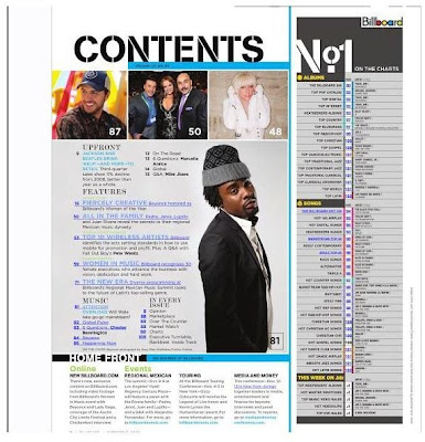
Billboard Contents Page Deconstruction


This is a contents page from the magazine- Billboard. 

Masthead- It is positioned at the top of the page, but not in the middle as there is a section on the charts.  It is black so it has presence on the white background.  The font used for the masthead makes it look more like a music magazine, however it is not smashed like the logo for 'Kerrang', so we know it is not a rock magazine.  I find the masthead intriguing, therefore I would like to use one similar to it for my project.

How easy is it to navigate around the page?- Out of the three magazine contents pages I have deconstructed, this contents page is the most easy to navigate around.  The images at the top are in line with each other and are all the same size.  The images will not all be the same size on my page.  One of them will be myself as the editor, which will not be too small, but not too large either.  

Necessary Information- The blue box below the masthead has the issue number.  The text for it is not big at all, unlike 'Q' which boldly lists its issue number.  Clearly, Billboard is not as established as Q.  At the bottom of the page is the 'Home Front' section, giving the reader the link to the magazines website.  There is also information on events such as tours.  This applies to my target audience so I think it would be a good idea to include this sort of information.

Text- The contents of the magazine are split into four different sections- 'upfront', 'features', 'music' and 'in every issue'.  Only the features are laid out in a detailed list, the other categories are in columns.  These subheadings are larger than the text below them, however there is not too much text.  The 'No.1 charts' section is not used in every magazine.  The words 'No.1' are the largest because when people are drawn to it, they will instantly know it is about the charts.  The numbers indicate what page everything listed is on and sometimes they actually replace worded text.  This is something I will do to give the magazine more identity.  The information at the bottom quickly tells the audience what they may want to know.  It is organized in columns and the subheadings are indicators for the audience. 

Font- The font type is sophisticated for the listings.  I found the same thing in Q magazine.  A more simple font is used for the information section at the bottom as it is not about what is actually involved in the issue.  The font used in the masthead is used again for the heading 'No.1' because it is also at the top of the page.  This draws the reader to the charts list.  This contents page is the most helpful as this magazine has the same target audience as mine.  I find the font used for the masthead and listings an interesting blend.  I will keep this page in mind when constructing my work.
 
Images- There are 4 images on the page.  The three at the top are all the same size indicating that the features on those pages are all equally important and take up relatively the same amount of pages.  Although the images do not have captions, fans will know who they are.  Plus, there will be information on them in the listings.  The page number which accompanies the main image is bigger and bolder.  The fact this image has much more focus makes it obvious that it will be an interesting page to turn to.  The main image on my contents page will relate back to the image on my cover.  It will intrigue the audience further as it will be accompanied by other images.

Colour- The colour palette is blue, black and grey.  There is use of light and dark blue, not only in the text, but in the shapes too.  The grey is used on the main image for the man's clothing.  It is also used in the charts list opposite.  Yellow is also used here to separate the lists.  The colours used are not particularly warm, except for the red and yellow in the Billboard logo.  This is positioned in the top right hand corner.  It has a white background so that it retains its own identity and is not involved in the other text boxes.  I will have dark blue and a lighter shade of green on my contents.  This will mix the essence of the colours as it will not be too bright, nor too dark.

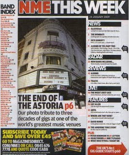
NME Contents Page Deconstruction


This deconstruction is of the contents page from an edition of 'NME'.

Masthead- Surprisingly, 'NME' does not use the word contents for its masthead.  Instead, it has the NME logo with 'This Week' after it.  It is positioned at the very top of the page.  The font is effective as some of the letters are conjoined.  The effect is that it makes the magazine look more modern.  I do not want my magazine to look outdated- it needs to be modern for its target audience.

How easy is it to navigate around the page?- It is fairly easy to navigate.  The listings are laid out on the right in a column, with the main article in the middle of the page.  The subscriber section at the bottom is easy to access because the word subscribe comes first, meaning any reader can see that it is a separate section.  This also applies to the 'Band Index'.  I am not planning on having an index or subscriber section, but I will include something extra, possibly about myself, as I will be acting as either a writer or the editor of the magazine.  The fact that each section uses either a different background colour or font colour helps to identify the way in which everything is separated. 

Necessary Information- The date is directly below the masthead.  It is very probable that the page number is at the bottom, however it is not visible on this picture.  At the bottom of the page, there are details on how to subscribe.  The fact it is telling the reader that they can save over £45 gives the magazine a better look as it is giving information in the form of advice.  Instead of a subscriber section, I think it would be interesting if I had a social section, which included links to Facebook and Twitter.  This would very much fit in with the target audience.

Text- The text is the listings and there is an index of bands.  Clearly, NME covers the different genre of bands in the music world.  The subheadings stand out, especially the one for the main article.  Numbers play a huge part on this page as they are used for informing and persuading.  The pun, 'GLASVEGAS' is effective because of the way it takes a place and changes it to fit in with a music theme, whereas the alliteration in 'Gig Guide' is effective because it is short and simple.  Puns are an interesting linguistic feature and I will certainly use one in my own work if it fits in well.

Font- The modern font used for the masthead is used for the subheadings that break up the listings and for the heading, 'Band Index'.  The smaller text uses a more simple font as it does not need to be as eye catching.  I will need to use modern looking fonts as my logo masthead has an older look to it.

Images- None of the listings have pictures with them.  There is a single image in the middle accompanied by text, but it is of a building and not a singer or band.  I like this idea.  If I am to use a main image with a headline on my contents page, it will probably be situated at the top of the page.  It is still interesting though as this single image is dedicated to a music venue- 'The Astoria', which is closing down.  This shows it is dedicated and does not just focus on the artists themselves.  There are two images at the bottom, however this section is separate from the contents of the magazine.  They are situated in the subscribe section and they are images of NME front covers.  Showing more than one edition will tempt the reader to subscribe if they haven't already as they have already been told that they will save money by subscribing.

Colour- Because the NME logo is red text with a white outline, a lot of the text is red.  However, the listings on the right are in a black font so they are dominant on the page.  This is because they are the purpose for this page.  The box at the bottom uses yellow for lots of its text so the reader knows it is meant to be separate from the rest of the items on the page.  The arrows at the side are black, however the arrow at the bottom is red and is larger, signifying that it is more important.  Bold colours also help achieve this.  If I use a range of shades in my magazine, then the reader will know what is more important.  The magazine images at the bottom have different colours on them which helps brighten up this contents page.  The page number indicators are red- NME's trademark colour.


Saturday, 13 September 2014

Q Contents Page Deconstruction


This is the contents page of an edition of Q magazine.  I have deconstructed the front cover of an issue of Q and am now looking at how one of its contents pages is designed.

Masthead- The Q logo on the front cover is placed in a red square, however here it is in a red rectangular box.  It is in the left hand corner of the page.  To its right is the word 'Contents' which is obviously the most vital word.  It is in a sophisticated font, but is not white like the Q logo.  Instead it is black to make the colours different.  It is placed at the top where you expect it be as the majority of magazine contents pages do this.  Not all magazines put their logo on the contents page and when they do, it is not massive.  I will place the logo of my magazine on my contents page.  It will be at the top, but positioned in the corner.  After all, it is not necessarily important. 

How easy is it to navigate around the page?- The layout of the page allows the reader to navigate easily.  Although the listings are the purpose of this page, they are kept to the sides so that the overall look of the page grabs your attention.  This helps you find what you need.  The page numbers are bold and the images they accompany are generally together to avoid confusion or untidiness.  There are two columns of listings, however in my case I am considering using three, shorter columns.

Necessary Information- The issue number is in the box at the top of the right side page.  This is issue 284 of Q, so we know it is a long running magazine.  It is important we know this hence the fact it is fairly big.  I will include the issue number on my contents page, except it will be much smaller than here.  The use of white text for the issue number makes it stand out against the red background.  The page number is at the bottom in the corner.

Text- The list of articles and features are laid out on the left of the first page and the right of the second page.  The order is that the left page lists the 'features' and the right page lists the 'regulars'.  There are subheadings above each listing, some are only one word such as the name of a singer.  I like this idea.  It is something I want to use.  There is not an overwhelming amount of text either.  The only part that contains a bulk of text is 'The Q Review', which is clearly a regular piece in each issue.  The purpose of the text is to inform the reader where they can find what interests them.  Some of the features are not only listed, but have a picture.  These pictures give the page that the feature is on.  The numbers grow in size based on how big the image is.  They help to split up the page.  The use of alliteration in 'Access All Areas' involves the reader by letting them know that they can read about the type of music that interests them by choosing from all of these 'areas'.  It would be an interesting idea to use alliteration or another linguistic feature in my magazine.

Font- The text stands out, but the same font is used regularly.  This causes the contents page to appear sophisticated.  Italics is used for the first feature on the list.  This is curious as it is at the top of the list and is the largest in size, however it is on page 58.  Evidently it is a 'must-read' feature.  Although I do not currently plan on using italic, I will make the main feature stand out more than the others.

Images- There are a total of 9 images.  They vary in size, but only the image of the anime character is large.  There is no caption next to the image, but I can see it is on the Gorillaz.  Fans of the group will instantly know that they will be heavily featured in the magazine.  The other images are of singers and bands.  Some of them are tilted to make the page more diverse- something I will consider for my contents page.  Two of them are actual pictures of what the article page looks like.  One of these shows a feature page called 'Planet Mika'.  The word 'Planet' is the most significant as it implies he is at his peak in terms of popularity.  There is also a cartoon version of the contents positioned in the top right- a unique edition to the contents.  Every image has either a page number or caption on it.  Two of the images, though have the page number beside them or underneath.

Colour- Red, white, black and purple are the colours that stand out the most.  Red and white are most frequent due to them being Q's trademark colours- making the contents page more warm than cold.  The character in the main image has purple hair which is instantly eye catching.  Though I want to use green a lot on my cover, there will be some blue.  Blue will be used more on my contents page.  The use of purple, pink and green on this image make it the most interesting, appealing item on the two pages.

Billboard Front Cover Deconstruction


This is my third front cover deconstruction.  This is an edition of 'Billboard' featuring pop sensation Rihanna on its cover.


Masthead- Because it is targeted at a young audience, the masthead has bright colours, I.e. red and yellow.  Rihanna's head is covering a large portion of the masthead, giving the impression that it is very popular amongst young people.  I do not plan on covering much of my masthead.  The fact only the first letter of the logo is a capital letter lets the audience know it is informal.  It is in the centre because the word is not short enough to be positioned in the top left hand corner. 

Text- The cover line about a conference at the top of the page is informative and does not have any imaginative words.  This is not repeated however on the rest of the cover lines.  I will have cover lines together on my cover, but there will be one or two that are positioned alone.  'Bull on parade' and 'killer app summit' are much more appealing to teenagers and young adults.  The headline tells the reader that the article will be about the 're reinvention of Rihanna'.  Not only is the headline different, but the strapline is even more so, informing us that Rihanna's fans don't really know who she is.  The reason it's the most involving item on the page is because it speaks directly to the fans and will undoubtedly pique their interest.  What's more, it is quoted by Rihanna herself.  For me, it will not necessarily be the headline that catches peoples' attention, more the props, as I plan on having a guitar in the main image.

Colour- The red and yellow circles on the masthead create the idea of summer.  The red represents heat and the yellow represents the sun.  Rihanna is wearing a summer dress which is a very light shade of pink- connoting she is feeling cool.  The use of white reinforces the idea of coolness.  The red lips symbolise love and lust alongside the red hair.  There is the use of green on the far right of the page which symbolises temptation.  This symbolism comes from the story of the garden of Eden.  Personally, I am not fond of the bright colours, although they do work better here considering the target audience.  As I wish to have a white background on my own cover, the colours I use will need to stand.  This will be accomplishable by using darker shades of green and blue, which also relate to the image and topic of my magazine.

Font Styles- The font styles used on the headline and strapline are certainly stylish.  The use of italic is effective due to the fact that Rihanna is positioned over to the right of the cover.  I do not currently plan on using italics for my text, but I may end up changing my mind.

Layout- The cover line at the top is situated between the letters B and D in the masthead.  This is much more interesting than just listing the features and articles at the side.  The cover lines that are at the side do not get in the way of the main image.  The whole right hand side is dedicated to the star, however we know she is the main star of the issue because her name goes right across the page.  My headline will be placed further to the right because there will be cover lines on the left.  The barcode, price and date are together in the bottom left hand corner.  It is often the case that the barcode is put in a certain place because there is no room for it anywhere else.  This denotes it is not an important factor when it comes to selling a magazine to an audience.  I will most likely put the barcode in the bottom left or right corner.

Images- Since it has a target audience of younger people, Billboard does not need to lavish the page with loads of images.  This is more common in magazines aimed at children, where the images play a crucial role in selling it.  The celebrity image here fills the page which makes it more noticeable over other magazines surrounding it.  The target audience will recognize the pop star when they are drawn in by the brightness of the image.  As I plan on using a white background, my main image cannot be too bright.  I like how this magazine has contrasted the lighting though.

Mise en scene- The models clothing is not detailed because it is not the main focus.  It does not come off the page like the makeup does.  The red lipstick and the red hair are typical of Rihanna.  The light is all on her, connoting she is a superstar.  Plus, it causes the red to become dominant.  The location is probably a studio that has set up the roses and the leaves.  Her facial expression is seductive.  She appears to be hiding from something which is connoted by her tattoo of a gun. The photo shoot appears to have a theme- danger.  Rihanna has a famous personality as a pop star.  Songwriters tend to have more subtle photo shoots, therefore from seeing this cover, I can see how different mine will look.

Pose- The pose is romantic/sexual.  Rihanna is looking at the reader as if she is telling them that she is single.  The use of red reinforces love and lust.  It also connotes danger, which some people may find attractive.

Semiotics- Particular things such as the bright colours and the use of the word 'fans' help me to understand who would be more interested in this cover.  It is clearly most appealing to Rihanna fans, however it invites the general young generation in by its stand out colour scheme and recognizable star.  This is similar to my idea as I am planning on using green to associate my cover with the latest album by Ed Sheeran, who is also a well known artist.