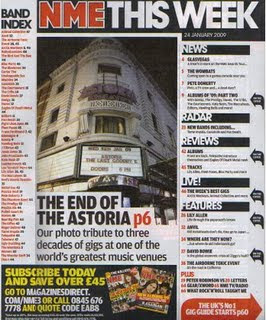
This deconstruction is of the contents page from an edition of 'NME'.
Masthead- Surprisingly, 'NME' does not use the word contents for its masthead. Instead, it has the NME logo with 'This Week' after it. It is positioned at the very top of the page. The font is effective as some of the letters are conjoined. The effect is that it makes the magazine look more modern. I do not want my magazine to look outdated- it needs to be modern for its target audience.
How easy is it to navigate around the page?- It is fairly easy to navigate. The listings are laid out on the right in a column, with the main article in the middle of the page. The subscriber section at the bottom is easy to access because the word subscribe comes first, meaning any reader can see that it is a separate section. This also applies to the 'Band Index'. I am not planning on having an index or subscriber section, but I will include something extra, possibly about myself, as I will be acting as either a writer or the editor of the magazine. The fact that each section uses either a different background colour or font colour helps to identify the way in which everything is separated.
Necessary Information- The date is directly below the masthead. It is very probable that the page number is at the bottom, however it is not visible on this picture. At the bottom of the page, there are details on how to subscribe. The fact it is telling the reader that they can save over £45 gives the magazine a better look as it is giving information in the form of advice. Instead of a subscriber section, I think it would be interesting if I had a social section, which included links to Facebook and Twitter. This would very much fit in with the target audience.
Text- The text is the listings and there is an index of bands. Clearly, NME covers the different genre of bands in the music world. The subheadings stand out, especially the one for the main article. Numbers play a huge part on this page as they are used for informing and persuading. The pun, 'GLASVEGAS' is effective because of the way it takes a place and changes it to fit in with a music theme, whereas the alliteration in 'Gig Guide' is effective because it is short and simple. Puns are an interesting linguistic feature and I will certainly use one in my own work if it fits in well.
Font- The modern font used for the masthead is used for the subheadings that break up the listings and for the heading, 'Band Index'. The smaller text uses a more simple font as it does not need to be as eye catching. I will need to use modern looking fonts as my logo masthead has an older look to it.
Images- None of the listings have pictures with them. There is a single image in the middle accompanied by text, but it is of a building and not a singer or band. I like this idea. If I am to use a main image with a headline on my contents page, it will probably be situated at the top of the page. It is still interesting though as this single image is dedicated to a music venue- 'The Astoria', which is closing down. This shows it is dedicated and does not just focus on the artists themselves. There are two images at the bottom, however this section is separate from the contents of the magazine. They are situated in the subscribe section and they are images of NME front covers. Showing more than one edition will tempt the reader to subscribe if they haven't already as they have already been told that they will save money by subscribing.
Colour- Because the NME logo is red text with a white outline, a lot of the text is red. However, the listings on the right are in a black font so they are dominant on the page. This is because they are the purpose for this page. The box at the bottom uses yellow for lots of its text so the reader knows it is meant to be separate from the rest of the items on the page. The arrows at the side are black, however the arrow at the bottom is red and is larger, signifying that it is more important. Bold colours also help achieve this. If I use a range of shades in my magazine, then the reader will know what is more important. The magazine images at the bottom have different colours on them which helps brighten up this contents page. The page number indicators are red- NME's trademark colour.
No comments:
Post a Comment