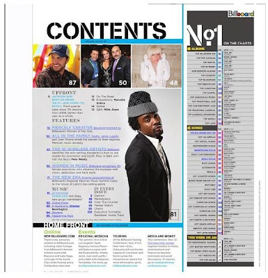
This is a contents page from the magazine- Billboard.
Masthead- It is positioned at the top of the page, but not in the middle as there is a section on the charts. It is black so it has presence on the white background. The font used for the masthead makes it look more like a music magazine, however it is not smashed like the logo for 'Kerrang', so we know it is not a rock magazine. I find the masthead intriguing, therefore I would like to use one similar to it for my project.
How easy is it to navigate around the page?- Out of the three magazine contents pages I have deconstructed, this contents page is the most easy to navigate around. The images at the top are in line with each other and are all the same size. The images will not all be the same size on my page. One of them will be myself as the editor, which will not be too small, but not too large either.
Necessary Information- The blue box below the masthead has the issue number. The text for it is not big at all, unlike 'Q' which boldly lists its issue number. Clearly, Billboard is not as established as Q. At the bottom of the page is the 'Home Front' section, giving the reader the link to the magazines website. There is also information on events such as tours. This applies to my target audience so I think it would be a good idea to include this sort of information.
Text- The contents of the magazine are split into four different sections- 'upfront', 'features', 'music' and 'in every issue'. Only the features are laid out in a detailed list, the other categories are in columns. These subheadings are larger than the text below them, however there is not too much text. The 'No.1 charts' section is not used in every magazine. The words 'No.1' are the largest because when people are drawn to it, they will instantly know it is about the charts. The numbers indicate what page everything listed is on and sometimes they actually replace worded text. This is something I will do to give the magazine more identity. The information at the bottom quickly tells the audience what they may want to know. It is organized in columns and the subheadings are indicators for the audience.
Font- The font type is sophisticated for the listings. I found the same thing in Q magazine. A more simple font is used for the information section at the bottom as it is not about what is actually involved in the issue. The font used in the masthead is used again for the heading 'No.1' because it is also at the top of the page. This draws the reader to the charts list. This contents page is the most helpful as this magazine has the same target audience as mine. I find the font used for the masthead and listings an interesting blend. I will keep this page in mind when constructing my work.
Images- There are 4 images on the page. The three at the top are all the same size indicating that the features on those pages are all equally important and take up relatively the same amount of pages. Although the images do not have captions, fans will know who they are. Plus, there will be information on them in the listings. The page number which accompanies the main image is bigger and bolder. The fact this image has much more focus makes it obvious that it will be an interesting page to turn to. The main image on my contents page will relate back to the image on my cover. It will intrigue the audience further as it will be accompanied by other images.
Colour- The colour palette is blue, black and grey. There is use of light and dark blue, not only in the text, but in the shapes too. The grey is used on the main image for the man's clothing. It is also used in the charts list opposite. Yellow is also used here to separate the lists. The colours used are not particularly warm, except for the red and yellow in the Billboard logo. This is positioned in the top right hand corner. It has a white background so that it retains its own identity and is not involved in the other text boxes. I will have dark blue and a lighter shade of green on my contents. This will mix the essence of the colours as it will not be too bright, nor too dark.
No comments:
Post a Comment